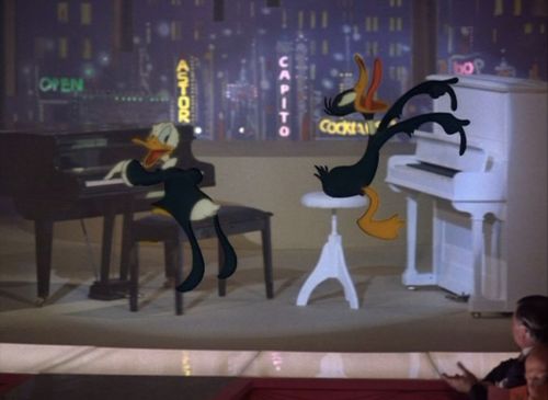
When it comes to classic animation most people are either a Disney or Loony Tunes fan. You either love Disney's animation for the high production values on their beautifully animated epics or you prefer the screwball comedy and the individuality Warner Brothers allowed the directors to have when directing the various Loony Tunes cartoons.
Mind you, I'm not putting down the artists at Disney who produced such great artists as Carl Barks and Walt Kelly. Both of which I would gladly polish their shoes.
But as far as my personal tastes go, I've always been a Loony Tunes fan and as for cartoons produced by Warner Brothers I've always enjoyed the ones created by Chuck Jones and Robert McKimson the most.
But it goes further than that. What made those cartoons so great for me was not only the directors but also Carl Stalling who had a knack of producing memorable scores and a talent for fitting music popular at that time. Writers like Michael Maltese who wrote the scripts. And finally the vocal talents of both Mel Blanc, June Foray and Arthur Q Bryan.
I don't know if most people realize that he and not Blanc did the voice of Elmer Fudd.
Influence is something I try to stress when I am teaching my animation class. Because I know quite a few of the students taking the class have been influenced by a cartoon. Either classic or current.
One of the thing I try to do while explaining the whole concept of influences is how it pertains to animation. I usually start with a current cartoon:
C. H. Greenblatt who created the series Chowder worked on the show SpongeBob SquarePants. The look and feel of SpongeBob has a great deal to owe (in my less than humble opinion) to the series Ren and Stimpy. John Kricfalusi, who created Ren and Stimpy, was very influenced by the look and the feel of the television cartoons of the 1950's and 1960's. He is also very influenced by animator Robert "Bob" Clampett. Both the cartoons he produced in the 1950's and 1960's and the work he did for Warner Brothers in the 1940's.
Bob Clampett's use of "stretch and squash" as well as overly exaggerating the emotions of the characters (i.e. jaw dropping and eyes bugging out) is owed to Tex Avery's cartoons.
So while I try not to discourage the students from drawing SpongeBob, I try to encourage them to find ways to use what has influenced them in the style of SpongeBob's cartoons and how they can use that in their own cartoons.
I have a real soft spot for Pogo Possum and the rest of the inhabitants of the Okefenokee Swamp. It was the comic strip that first really got me interested in pen and ink artwork. I remember hours upon hours of practicing the way Walt Kelly would do ink the backgrounds in his comic strips as well as his character design.
Kelly started out as an artist for Disney before branching off and doing his own thing with comic books and newspaper strips. But you can see the Disney influence in his style. Especially with Pogo.
This was back in the days when the daily comics were an art form and you weren't trying to fit things into a panel the size of a postage stamp.
It was another comic my Dad got me into through his own love and enthusiasm for the strip. What we both loved the way Walt Kelly would mangle the English language to give his characters a certain "southern hospitality" in the way they talked.
Again, the charm of the strip was not in the punchline in the end but with the way the characters would talk with one another and the inventive words Kelly would create in the same tradition of Popeye and Krazy Kat.
Another artist I love is Chuck Jones. I have probably mentioned it in many of my previous blogs but I would probably go on record in saying that he is by far my favorite animator of all time. Granted not everything he did was a masterpiece. I never liked his Tom and Jerry. But with that said, his great animations outweigh his less successful ones.
So, you can imagine my delight finding out that two of my favorite artists worked together on a half hour animated special called The Pogo Special Birthday Special in 1969.
For years I had wanted to see it. There are only three Pogo animations in existence and I had only seen the claymation I Go Pogo back in the 1980's. Despite having actors like Jonathan Winters, Vincent Price and Arnold Stang, I never cared for it. It had it's moments but I just felt unsatisfied at the end.
I was finally able to get a copy of Kelly/Jones joint venture a couple years ago. I watched it knowing full well that Walt Kelly himself disliked the outcome of the project. It happens sometimes when you have two very distinct artists with two very distinct styles come together. It's not always a match made in heaven because both artists have very definite ideas of how they want it to look.
According to an interview with Disney artist Ward Kimball, in my battered and well-loved copy of Phi Beta Pogo, Kelly was livid how Chuck Jones changed the original script he had written really taking a lot of the teeth out of the story. And what bugged him even more is how Jones gave Miss Mam'selle Hepzibah a humanized face. Apparently when Kimball had dinner with Kelly at a restaurant and asked who okayed this change to the character, Kelly's face turned red and he bellowed, "Waiter! Bring me another bourbon!"
But with all that said, I liked it. Sure, for someone who loves the classic Pogo comic strips it's definitely a watered down version of Pogo. But it's a really enjoyable watered down version.
The Pogo strips were very satirical and loaded with political and environmental messages. A lot of which was a little too grown-up for a younger audience. So, the story written is a cute and a lot of fun.
And in Chuck Jones's defense, he actually sticks very close to the way the Pogo characters look in the comics than a great deal of comic strips adapted to animation.
I remember a Heathcliff and Dennis the Menace series from the 1980's that bore very little resemblance to their respective series's. COMPLETELY changing the character design to some of the incidental characters and adding characters that are nowhere to be found in the comic series.
The characters designs in the Pogo animation looked like the characters from the strip being published at that time and acted in a way that you would expect the characters to act.
What's also a great deal of fun watching the special is Walt Kelly and Chuck Jones practically voice every character with the exception of a few.
Kelly is relatively good doing the voices of PT Bridgeport, Albert Alligator and Howland Owl. Actually, while he's doing PT Bridgeport and Albert, I could have confused him for Mel Blanc. Who did a great deal of work for Chuck Jones both with Warner Brothers and some work with the cartoons he did for MGM.
Jones isn't as good as Kelly is voicing multiple characters. Although, I thought his voice seemed strangely suitable for Porkypine. It should be said, Porky has always been a character I've felt kind of a kinship with. I think mostly because I can see a lot of my own personality in him. A bit prickly, a little bit of a loner but deep down very well meaning and appreciative of the people in my life who have been there for me.
Or something like that.
You also have the brilliant June Foray providing the voices of Pogo Possum and Mam'selle Hepzibah.
Although there are some weak spots in the animation, which I imagine was due to cost and you really could not do something Fantasia quality on a television program budget at that point in time. But compared to many cartoons being churned out at that time which were increasingly becoming blander and shoddier looking The Pogo Special Birthday Special is quite good and very stylishly done for that time as far as the art and animation is concerned.
If I have peaked your curiosity some thoughtful person was very kind to post the special on Youtube. Try and keep an opened mind watching it and look at it from an art appreciation perspective.
For those of you who have known me since way back when, I use to draw cartoons all the time. I did cartoon characters all the way up till my last year of college in the school newspaper.
I usually don't do cartooning much nowadays except for in the classroom. I suppose it's like riding a bicycle for me. Even though I do work that is vastly different from the stuff I did in High School or even college, I can still dig into that little storage locker in my brain and dig it out.
Which is what I had decided to do when I saw this contest Narragansett Beer was holding for their upcoming Father's Day Tie. I had chickened out last year but I decided to take a brave stab at it this year in the only way I know how.
And spending the day watching Looney Tunes gave me all the inspiration I needed.
Since I connect Narragansett with 1950's and 1960's Americana, I really wanted to tap into that. No puns intended. So, I wanted to create this Dad in the image of people like Steve Allen, Phil "Sgt. Bilko" Silvers or Arnold "Top Cat" Stang.
I really drew heavily upon Hannah-Barbera, Rocky and Bullwinkle, UPA characters, Chuck Jones and Friz Freleng. Especially some of Frelengs more stylized and sometimes simplified designs from the 1950's.
And I threw in a little John K. just for good measures. Although, I know it doesn't show up in the results, I've always loved John K's stylized characters and had that in mind when I was creating this.
Also, another rule of the contest was to use Narragansett imaging for the design. So, I incorporated a great number of the bottle designs into the character. The design of the tie was taken from one of the old designs from the Narragansett cans. The color of the hair was also taken from the same thing as the tie. The shirt was taken from the colors of Narragansett Lite and the trousers were from the color of the label on Narragansett Bock Beer.
The glass he is holding is from an image on one of the older labels.
I created a background image for the character which will use the design from the Narragansett Lager.
 When it comes to classic animation most people are either a Disney or Loony Tunes fan. You either love Disney's animation for the high production values on their beautifully animated epics or you prefer the screwball comedy and the individuality Warner Brothers allowed the directors to have when directing the various Loony Tunes cartoons.


